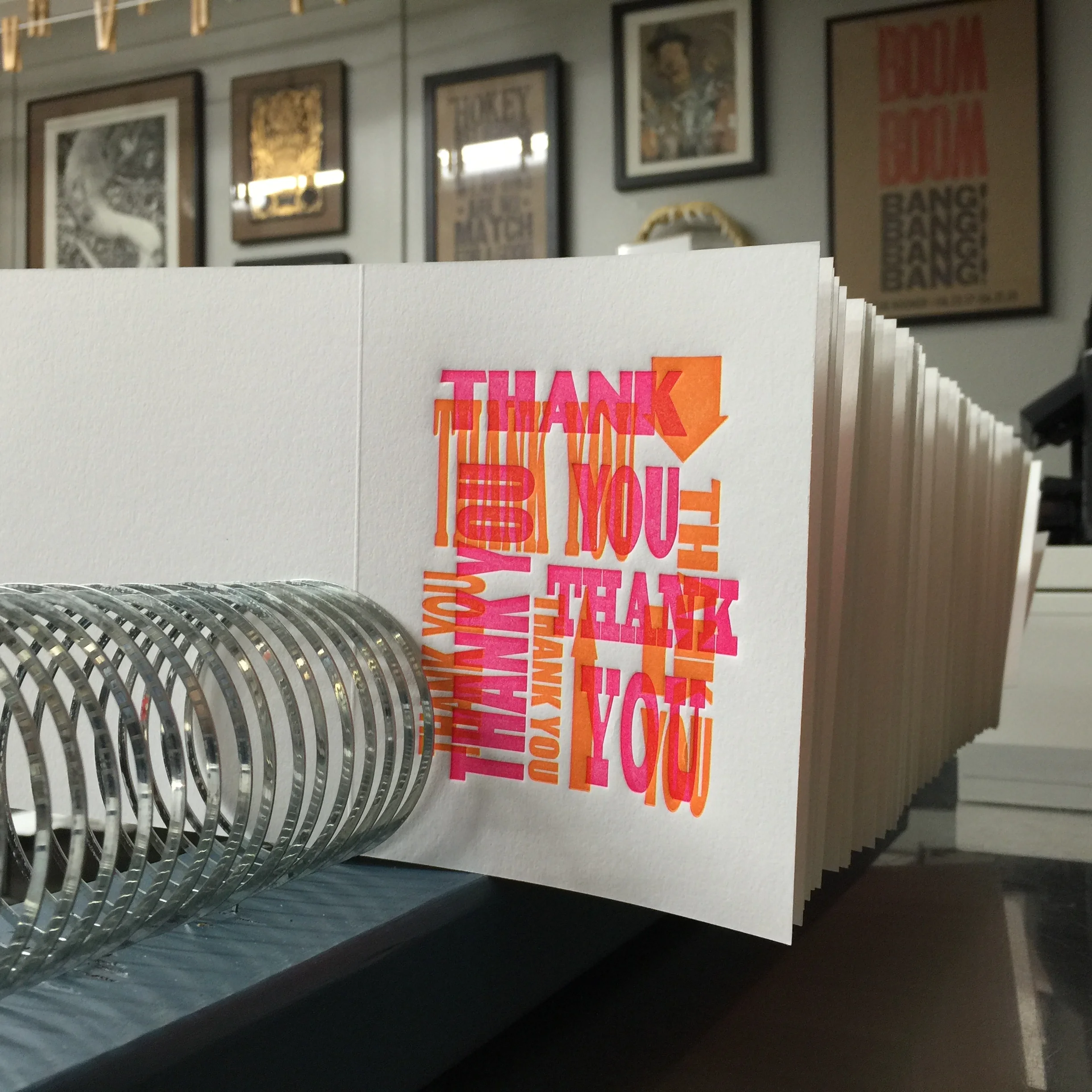
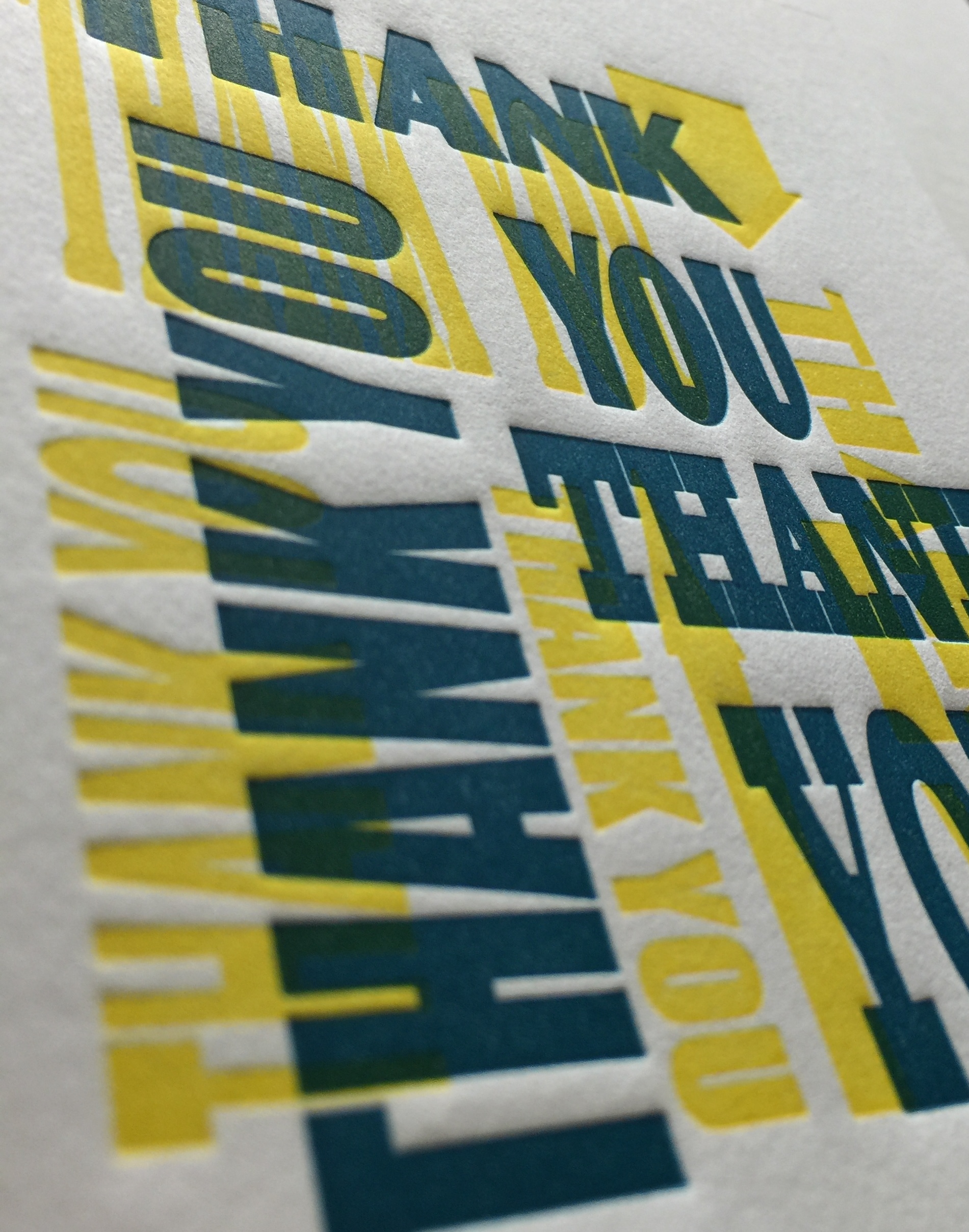
This was a fun project! I've always loved how a 3rd color emerges when 2 colors overlap, especially in letterpress printing. So I decided to make some new Thank You note cards that would play with this idea.
The color ways I decided on were neon pink and orange, concrete grey and navy, and bright yellow and turquoise. The 1st plate went on and we printed a ton of cards in the 1st colors. Then I got sidetracked with 10 other projects!
A few weeks later, the 2nd plate went on and we printed the cards with their 2nd color, which created the overlap color in the process. I blended the ink colors, and put a spot of "transparent relief medium" with the 2nd colors to really push this overlap, but I wasn't too happy with how thin the ink looked so I scrapped the medium.
I wanted that old broadside block print lettering look, so I sketched out and designed 2 plates worth of "THANK YOU's", which when printed over each other would have some really cool overlap in the colors. Plus, using polymer plates allows for a deeper impression then using old wooden type.
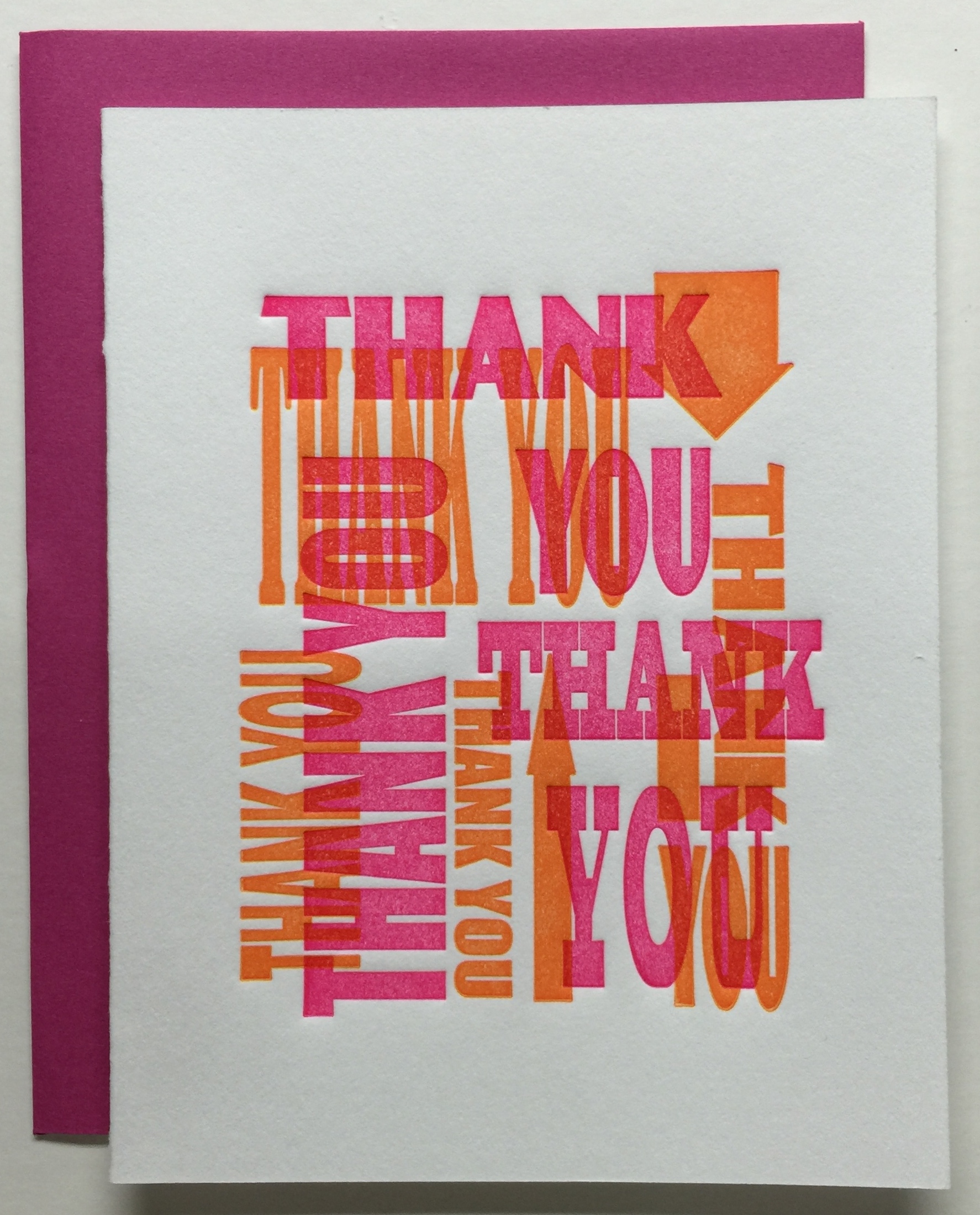
Here they are completed! We matched each card with similar color envelopes and called it a day!
The shop favorite is the pink and orange!
I'm looking forward to playing around a lot more with color and using these plates in the future as a vehicle for experimenting!


